Lightning Modal / Popup in Salesforce
Lightning Modal is an UI component that improve user experience by presenting information or accepting user input without moving away from current screen. It is mostly used for editing or creating records and confirmations in overlay.
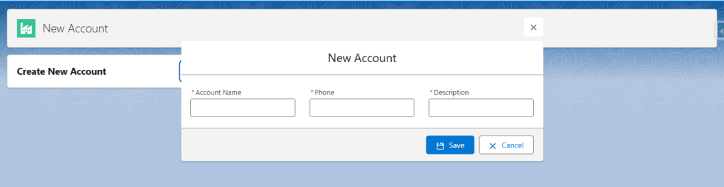
Lightning Modal Example in Lightning Aura
Modals have three parts body, header and footer.
ModalsAndNavigation.cmp
<aura:component implements="force:appHostable,flexipage:availableForAllPageTypes">
    <aura:attribute name="openModal" type="Boolean" default="false"/>

    <lightning:card title="Create New Account">
        <aura:set attribute="actions">
            <lightning:button label="New" variant="Brand" iconName="utility:add" onclick="{!c.openModal}"/>
        </aura:set>
    </lightning:card>

    <aura:if isTrue="{!v.openModal}">
        <section role="dialog" tabindex="-1" aria-modal="true" aria-labelledby="modal-heading-01" class="slds-modal slds-fade-in-open">
            <div class="slds-modal__container">
                <div class="slds-modal__header">
                    <lightning:buttonIcon iconName="utility:close"
                                          onclick="{!c.closeModal}"
                                          alternativeText="close"
                                          variant="bare-inverse"
                                          class="slds-modal__close"/>
                    <h1 id="modal-heading-01" class="slds-modal__title slds-hyphenate" tabindex="-1">New Account</h1>
                </div>
                <div class="slds-modal__content slds-p-around_medium" id="modal-content-id-1">
                    <div class="slds-grid slds-gutters">
                        <div class="slds-col slds-size_4-of-12">
                            <lightning:input label="Account Name" type="text" required="true"/>
                        </div>
                        <div class="slds-col slds-size_4-of-12">
                            <lightning:input label="Phone" type="tel" required="true"/>
                        </div>
                        <div class="slds-col slds-size_4-of-12">
                            <lightning:input label="Description" type="text" required="true"/>
                        </div>
                    </div>
                </div>
                <div class="slds-modal__footer">
                    <lightning:button label="Save" variant="Brand" iconName="utility:save" onclick="{!c.save}"/>
                    <lightning:button label="Cancel" variant="Neutral" iconName="utility:close" onclick="{!c.closeModal}"/>
                </div>
            </div>
        </section>
        <div class="slds-backdrop slds-backdrop_open" role="presentation"></div>
    </aura:if>
</aura:component>
ModalsAndNavigationController.js
({
	openModal : function(component, event, helper) {
		component.set("v.openModal",true);
	},
    closeModal : function(component, event, helper){
        component.set("v.openModal",false);
    }
})
Common issues in Lightning Modals
Overlay is not working in Lightning Modal (Background is not faded)
In this scenario your modal will embed on a current page instead of opening in layer on top of current screen.
Solution
Add <div class="slds-backdrop slds-backdrop_open" role="presentation"></div> after closing section tag.
<section role="dialog" tabindex="-1" aria-modal="true" aria-labelledby="modal-heading-01" class="slds-modal slds-fade-in-open">
.
.
.
</section>
<div class="slds-backdrop slds-backdrop_open" role="presentation"></div>
Lightning Modal close button icon
If class="slds-modal__close" class is not added in button icon it will move in center or disappear.
If button icon is not present inside the header it will appear like below

class="slds-modal__close"Solution
<div class="slds-modal__header">
     <lightning:buttonIcon iconName="utility:close"
                           onclick="{!c.closeModal}"
                           alternativeText="close"
                           variant="bare-inverse"
                           class="slds-modal__close"/>
     <h1 id="modal-heading-01" class="slds-modal__title slds-hyphenate" tabindex="-1">New Account</h1>
</div>
Salesforce modal is a great way to enhance user interaction by keeping users engaged without navigating away from their workflow. By understanding how to use them can effectively improve your application’s usability and intuitive user experience.

Hi there it’s me, I am also visiting this website on a regular basis, this
web site is truly nice and the users are truly sharing nice thoughts.
Very interesting and informative content! I always find this site
reliable and full of valuable knowledge.